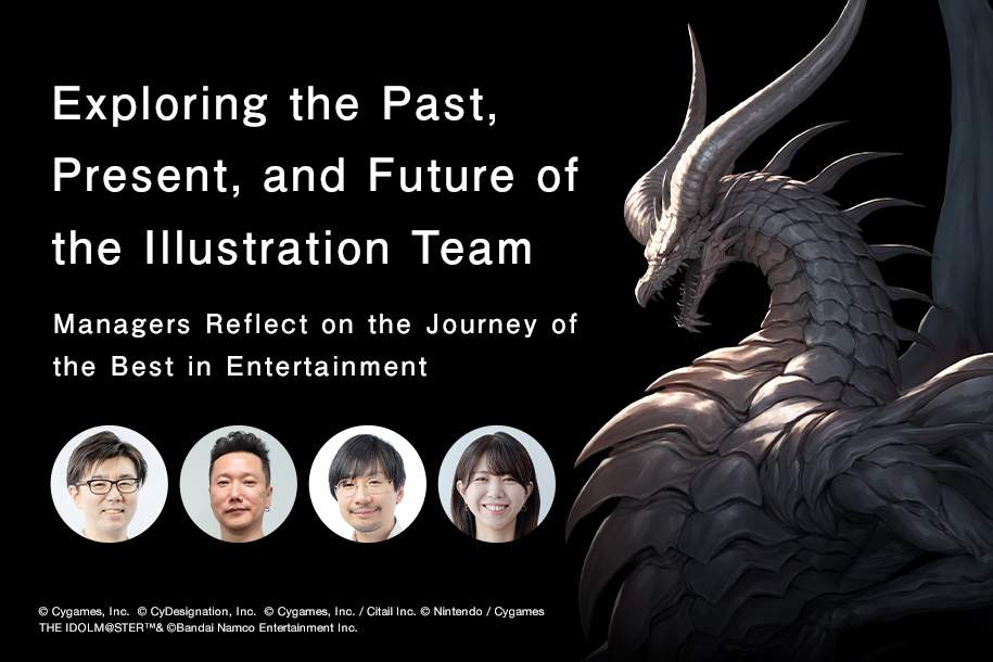
What’s Changed and What Hasn’t Over the Six Years Since Launch: The UI Design That Forms the Foundation of the World of Granblue Fantasy (Part One)
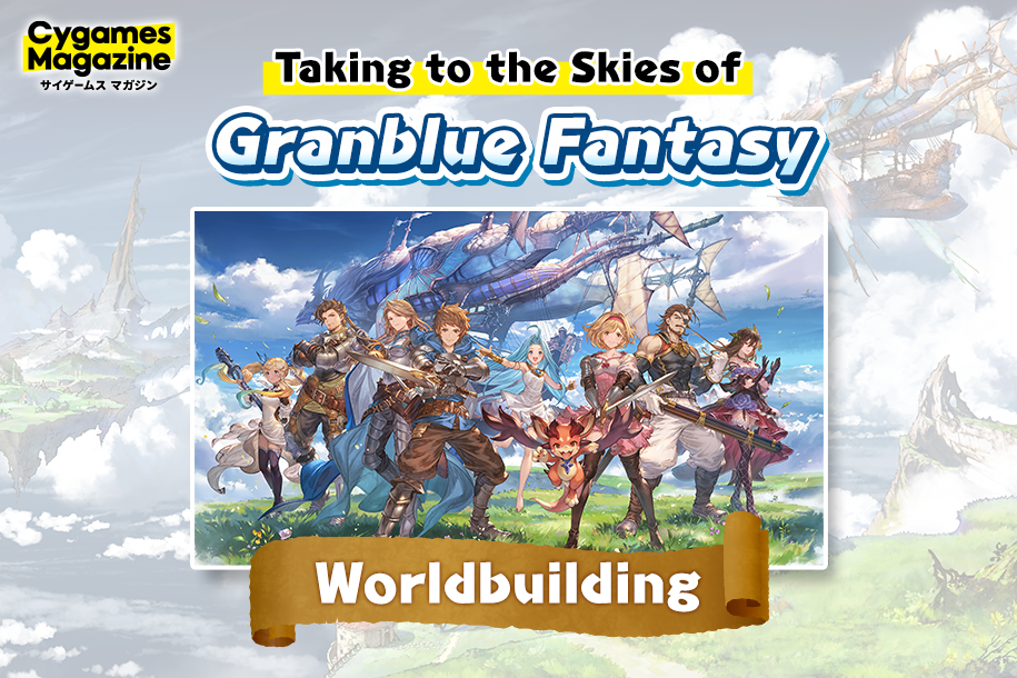
Granblue Fantasy (“GBF”) is Cygames’s flagship title. Thanks to the support of our players we have just entered our sixth year of service since the game’s launch.
One of the most important elements that contribute to the world of GBF is the game’s unified, consistent UI design. Over the last six years we have made some changes while still maintaining the sense of GBF that players have become familiar with. This has been made possible behind the scenes through an impeccable attention to quality from our UI designers. As part of our Cyskill project we sat down with the GBF UI designers to ask them about their particular UI design philosophies, how the UI has evolved over time and what changes are yet to come.
- UI Designer – Interaction Designer TeamNozomi

- Joined Cygames in 2015 after working as a designer for social games. After joining the GBF team and acting as UI team leader, Nozomi is now director of UI design while also working on UI production.
- UI Designer – Interaction Designer TeamSayaka

- Joined Cygames in 2015 after working as a 2D designer for social media services. She is currently involved in the development of GBF as a designer and is in charge of training for on-site team members.
UI Designer Goals and Ideals: What Creates a Consistent Look and Feel for GBF?
Can you start by giving me a basic rundown of the job of a UI designer?
Nozomi: UI stands for User Interface, so in a game this refers to the elements that make up the game screens and the functions performed while changing between screens. More specifically, this refers to on-screen elements that the user can see and interact with like windows, buttons, or menus.
The job of a UI designer is to arrange and set the size of individual interface elements, design the visual aspects of the interface, and utilize appropriate font types and sizes so that the player can easily perform the functions they want, see the information they want to see, and further enjoy the GBF experience.
The UI sounds like a vital component in determining the user’s gameplay experience. What aspects of the UI for GBF did you particularly focus on?
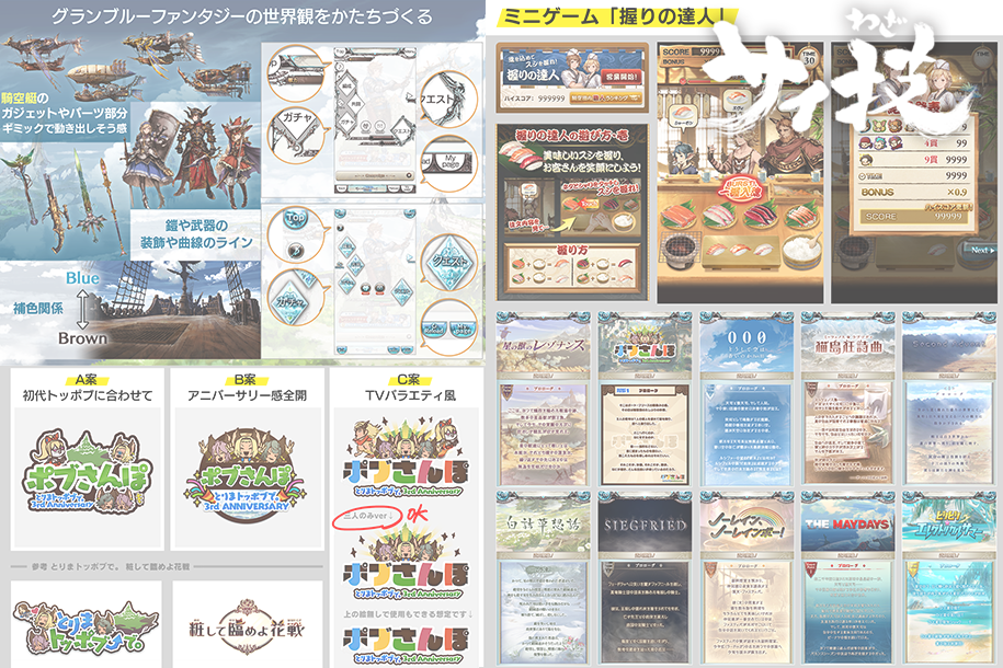
Nozomi: From the very beginning our top priority for the UI has been to ensure that it reflects the worldview of GBF.
The world of GBF conjures up images of blue skies peppered with floating islands and bustling with airships like the Grandcypher. I think this is what comes to mind for anyone familiar with GBF. We’ve tried to encapsulate that image in the UI design as well so that our players can fully immerse themselves into the game world.
Basically, we tried to incorporate elements of the airship designs and the adornments on the armor and weapons used by the game’s characters and their silhouettes into the designs of the frames, buttons, and other UI components. By establishing design rules like this for individual UI elements we were able to build a consistent GBF look and feel.

So by incorporating common things that a player sees while they’re playing the game into the UI, this helps the player naturally feel like they’re experiencing the world of GBF.
Nozomi: Exactly! Color is also an important element of the design philosophy for GBF. In particular, we use our cyan blue sky color in key elements throughout the UI. The other major color we use is the brown color in the hull of the airships. Our UI designer at the time said that these two colors are complementary and work well with each other. For example, a basic rule we follow is that we use brown for frames and blue for buttons. We also use a light brown for Cancel buttons and blue for OK buttons.
By establishing basic color rules like this and limiting the color palette we can clearly define the role of each color to the player and ensure that they can navigate through the game without confusion.
Nozomi: We also have rules for the materials we use for different UI components. Frames should look thin and hard. For buttons, we want them to look like transparent chunks of ore. We want to make it clear how different components function by using not only different colors but different material types as well.
By employing these rules throughout the entire game we can create a unified sense of design in the world of GBF.
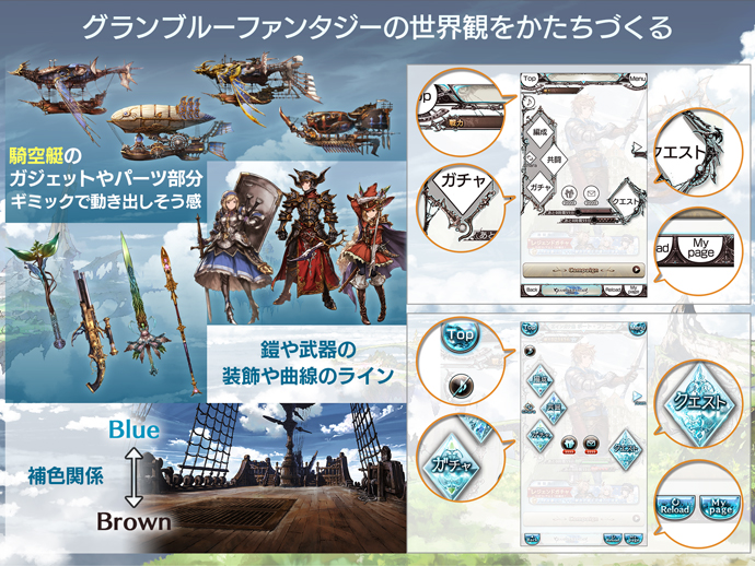
I see. In the six years since the game launched the world of GBF has continued to expand. For example, you’ve had story events in collaboration with other intellectual properties covering everything in tone from fun and whimsical to serious. Does that influence your UI design at all?
Nozomi: For sure. Every in-game event has a completely different flavor and we try to design things in such a way that the core essence of the GBF world isn’t lost through that. But we don’t have any hard rules as to the extent of what we can change, so depending on the situation we may, for example, use the same color scheme but try introducing new motifs or change fonts or frames. It’s a trial-and-error process for every designer in charge when it comes to new projects.
Sayaka: Nozomi always checks everything so thoroughly that I feel comfortable going all out with new design work. For story events, we have had everything from a mainstream GBF fantasy adventure like What Makes the Sky Blue III: 000 (launched at the end of February, 2019) to more fun and lighthearted ones like A Walk on the Wild Side (launched at the end of March, 2019). I was actually the designer in charge for A Walk on the Wild Side. I went all out for that one! (Laughs)
Nozomi: We did A Walk on the Wild Side in the style of a variety show, so we intentionally used a lot of colors that we don’t normally use. My role in that project was to help incorporate and balance those novel design elements in such a way that we didn’t lose the overall GBF feel.
So basically you always leave a bit of the feel of the GBF world in as a base, then determine how much to diverge from that depending on the direction and style of each individual event?
Nozomi: That’s right. Each event has its own unique worldview which we create by maintaining the usual GBF tone for colors and materials while adding on new elements for each individual event. For tie-in events we try to design everything in such a way that the world of the IP we are collaborating with shines through and so that players can appreciate what makes that particular IP so interesting. But if we go too far with that then we risk losing the feel of GBF, so the whole team works together to make sure it’s all balanced.
Sayaka: An example of where we diverged from our normal design principles would be when we designed the social media images for A Walk on the Wild Side. We used strong blues that we wouldn’t normally use for GBF and went for a powerful design using multi-layered frames. Even in-game we made a lot of design choices that were very different from other story events while also coordinating the look of the event tips interface with that of common elements in the raid battle description area so that everything looked cohesive.
Sayaka: Sometimes I can take it too far but Nozomi will always let me know if I’m getting out of hand. (Laughs)
Nozomi: As long as the design team understands the basic concept, they won’t deliver a design that’s too off the mark. Beyond that it’s just a matter of how far to go with it and that’s a process of exploration and figuring out what works and what doesn’t.

Layout and Design: Mini-Games Packed with the Essence of UI Design.
How do you determine who to assign to what task when you’re dealing with a variety of different UI design jobs?
Nozomi: Generally the team leader looks at the schedule and then assigns tasks out to the UI team members. Sometimes team members volunteer themselves and sometimes the leader makes assignments based on individual expertise.
Sayaka: For tie-in events we always get someone who is a fan of whatever IP we are collaborating with to take on those tasks! Someone who’s a fan already will have an easier time coming up with ideas for what sort of gameplay they want or what would make the fans happy. So a lot of times when we have an idea we take the suggestion to a project planner and see how they like it.
Sometimes they’ll give us the green light but sometimes they’ll say it’s too much, so whenever we submit rough sketches or design proposals, we will submit one that really pushes the limit, one that follows closely with our GBF design principles, and one that is somewhere in-between.
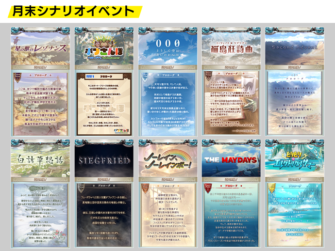
Nozomi: A Walk on the Wild Side is one of the events that ended up having a design that was really out there. Besides that, we’ve started adding mini-games to our story events more often, and our team a tendency to have a lot of fun with the mini-game UI design.
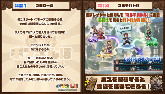
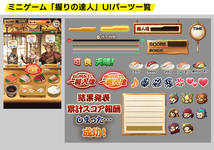
Sayaka: There was The Sharkening in The Maydays (launched at the end of June, 2019) where you have to defeat a flying shark, or Supreme Sushi Chef in Kappa Summer Chronicle (launched at the end of July, 2019) where you have to make sushi… Yeah, I guess we tend to go a little crazy with the mini-games. (Laughs)
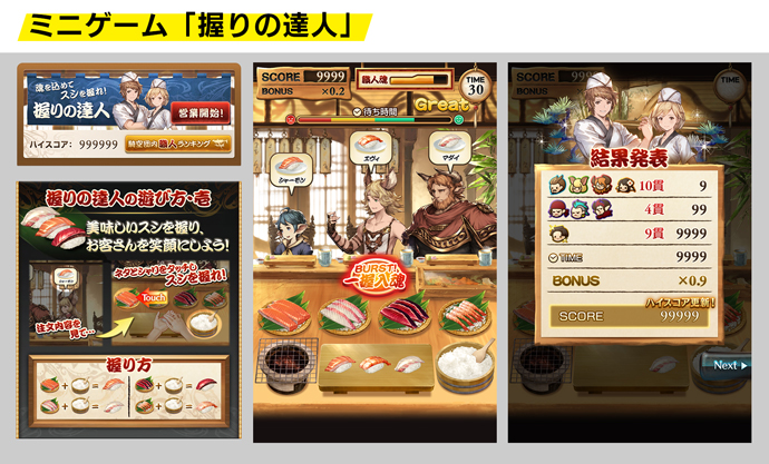
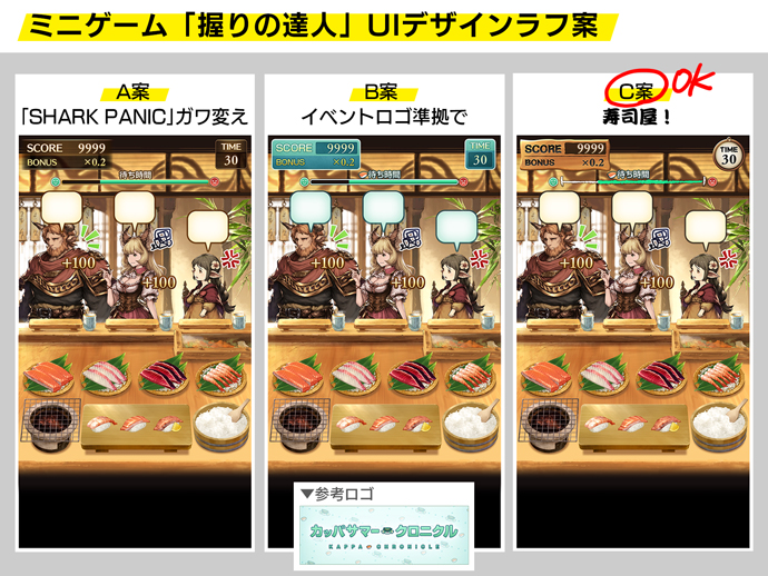
Supreme Sushi Chef was a lot of fun. I spent a lot of time playing it! (Laughs)
Nozomi: Mini-games are actually where you can see the core essence of UI design shine. The overall design for story events is generally pretty set in stone, but mini-games are completely different every time so we have to think about the layout of the game screen as well as the visual design.
Sayaka: That’s right. By the time we get involved, certain components like the score frame, the “time remaining” gauge, and other information indicators have already been decided, but we have to figure out the best way to lay out those components on the screen. The planner will provide us with a kind of a wireframe—a basic visual guide—that the UI team can plug the actual UI components into and try different layouts to see what works and what doesn’t as we improve it iteration by iteration.
Nozomi: In addition to this layout work, we also think about the design of each component in terms of shape, color, and animation. This is the decorative part of the process that we focus on to create a better experience for our players. A good UI has a good layout and good visual design, and in that sense I think that creating the UI for these mini-games really tests our abilities as designers.
Sayaka: Some designers are better at layouts and some are better at visual design so depending on the project we may divide those tasks up between different designers. But for GBF, most of the time one designer is in charge of everything.
Do you mean that one designer does everything for each story event?
Nozomi: Yes. Most of the time one designer is in charge of everything, including mini-games and other work involved in a story event—tasks such as the creation of a logo, top page, tips, banners, and social media graphics. For anniversaries and other major events we might consider splitting the workload, but generally everything is handled by one designer.
Being Conscious of “Who Would Use This?”: Implementing Improvements That Don’t Feel Out of Place
When working on layout and design, is it necessary to implement each UI element into a test build? Is it a kind of trial-and-error process as you test out the feeling of different layouts and designs?
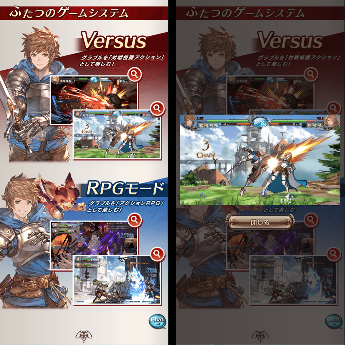
Sayaka: It depends on the event, but for everything other than mini-games the layout is usually already determined by a wireframe. For example, the in-game special event page for Granblue Fantasy: Versus already had a nearly complete wireframe to work with, so the rest of the design only came down to changing minor details like optimizing font size for readability or adjusting the position of the video player.
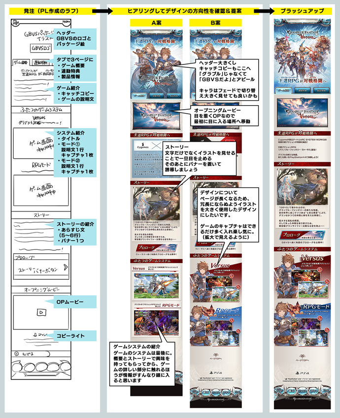
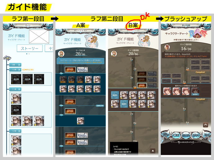
Nozomi: For an example of something we designed through trial-and-error, we did a major redesign of our story event top page UI for our 5th anniversary in March 2019. It was a complete overhaul of the UI. We made several different drafts of the page based on the wireframe our project planner made and showed those to the director who’d give us feedback that we’d use to make even more changes with and then repeat the whole process again.
Sayaka: It’s harder to update existing assets than it is to make new ones because any time you change something that you’re already used to it’s easy to make something feel out of place. When you’re working on something completely new, the UI team can work together from scratch so that feeling that something is off doesn’t come up as often.
When it comes to UI design, do you think it’s better for users to not feel like anything has dramatically changed?
Nozomi: Sometimes, yes. GBF has a lot of players who’ve played the game for years, so if we change anything too much they’ll have difficulty adjusting. That’s a big reason why, like we talked about earlier, updating the story event page UI was such a challenge. We were really concerned with how our players would react.
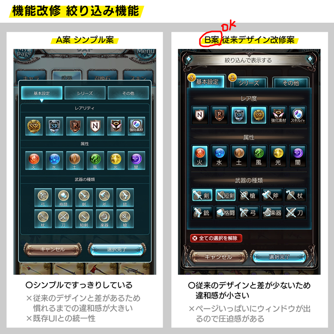
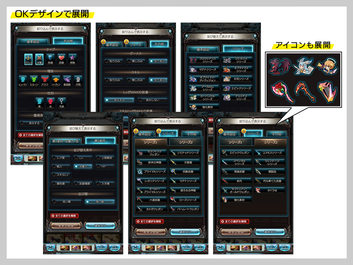
Sayaka: We also recently revamped the sort function. At first we were thinking about remaking everything with a simple look like we have on the Treasure Trade page, but in the end we decided to not make any drastic changes to its appearance after all. This is a page that players use often and are already used to, so we tried to redesign it in a way that made it easier to use without changing the look of the page so much that it would feel unnaturally different.
Nozomi: When we’re making updates we focus on what kind of player is interacting with that screen most often. So in contrast to the example we talked about earlier, we tend to prioritize usability for screens used more often by relatively new players. For example, we are more comfortable making bigger changes to the Settings or Help screens.
Have there been any times where you made updates to a UI but nobody really noticed or talked about it?
Sayaka: We actually made some significant updates for Unite and Fight.
Nozomi: Then there was the new flat design for redux events.
Sayaka: We also secretly reorganized the news page. Over the years the number of items on the page has increased, so we put them into groups to make the page less cluttered. We also wanted to show off the high-quality illustrations more, so we made the display area for that larger without changing the way a player starts the game.
Nozomi: We also added a lot of useful little details on the Help page for newer players.
Sayaka: Yeah like adding icons for each item in the News pop-up, boring stuff like that. (Laughs)
Nozomi: That’s right! GBF updates are always huge, but the UI team works on even the smallest details for each and every one. We make changes and adjustments down to the pixel, like a slight hue or luminance change. They’re often very slight differences, but these changes are definite improvements and are a part of our philosophy to always strive to make something better.

Nozomi: Whenever I’m working as an editor on a project I’ll look at these little details, give feedback, and have my team members fix anything we think is an issue. It’s tedious work but everyone on the team puts in the effort to make a quality product. After going through all that you really feel a sense of accomplishment when the project director looks it over and gives it the OK on the first review. (Laughs)
Sayaka: She’s really like the team’s mom over here. (Laughs)
So I’m guessing it’s pretty rare for you to get the OK from your director on the first submission?
Nozomi: Yeah, usually. For completely new designs there’s a lot of trial-and-error so it might come back to us for revisions three or four times. I myself might put the staff through four or five revisions. But, you can really see how the quality improves with each iteration of this process. I have learned so much from my director and previous editors so I feel like I am passing that knowledge along to my team members now.
Sayaka: A lot of times the feedback I get is about spots that I never would’ve noticed on my own. Even if it’s something really minor, fixing that can result in a real improvement in overall quality. I’m really thankful to have an editor to review everything. It’s always a good feeling to look at the final product after all that hard work and see how good of a design you’ve created when it’s finally released!
Nozomi: I agree. It’s been six years since launch and now our players are used to using native apps* so we have to be conscious of that difference. For example, browser games require loading between each screen transition so we usually try to pack a lot of elements into a single screen that players can scroll through to cut down on the amount of loading. On the other hand, native apps aren’t usually designed like that so the UI team tries to propose ideas for designs that don’t require as much scrolling.
*Apps that are installed to a smartphone or tablet through an app store for that particular device.
Sayaka: If we have a design where scrolling is necessary then we try to put in fun elements for the player to make it more interesting. Looking at the Granblue Fantasy: Versus page we talked about earlier as an example, we made it so that you can tap the play screen to enlarge the image. This way it’s a little more interactive than the player just staring at the screen.
Nozomi: Sometimes being a browser game gives us some advantages too! For example, we can do a lot of detailed data updates and not worry as much about device storage requirements.
What do you think is necessary from a design perspective to reach that balance between ease of use and maintaining the feeling of the world of GBF?
Nozomi: When it comes to maintaining the look and feel of the world of GBF, the basis for the UI comes from the high-quality illustrations made by the illustration team. Our job is to utilize those illustrations and showcase them in our designs. When we’re designing header and banner images, we’ll take color information from character and background illustrations and use that throughout our designs and coordinate our color schemes to match. We’ll also use similar colors from the illustrations in our UI components so that they don’t look off-base when placed next to the characters and other images.
Then on top of that we have to consider the optimal design and layout from the player’s perspective to determine what will be the easiest to see and use. It’s taken many iterations of both of these aspects in the design process to get the GBF UI to where it is today.
Sayaka: I consider the UI to be the bridge that connects the player to the game world. I think it’s our job to design the UI as the best possible “supporting role” to complement the major game elements like the illustrations in order to further immerse the player.
In the second part of this series, which will be published next week on March 23rd, we’ll ask the leaders of the UI team about their thoughts on the design process for the real-life events and merchandise they also work on outside of the game. We’ll find out how GBF is expanding out into the real world and what they cherish most as UI designers. Don’t miss it!
Editor’s Notes
With six years of GBF, there was too much information to cover entirely in the interview, so I listed the items related to UI design for all updates up to the end of last year.
It’s really overwhelming to think about all the content we didn’t write about here, smaller updates, and all the update content not related to UI design at all!
| 2014 Updates | |
| March | -Weapon/Summon uncap levels are now shown on the Inventory, Sell, Party, and Crew screens. |
| April | -Added the ability post to Twitter and LINE from the Profile screen. -Added the ability to show or hide pop-ups upon using a skill. |
| June | -Current party is now displayed on the Profile screen. -Added a chat function to the Unite and Fight top page. -Added the Bonus, No Bonus items to the Recommended Upgrade Settings. 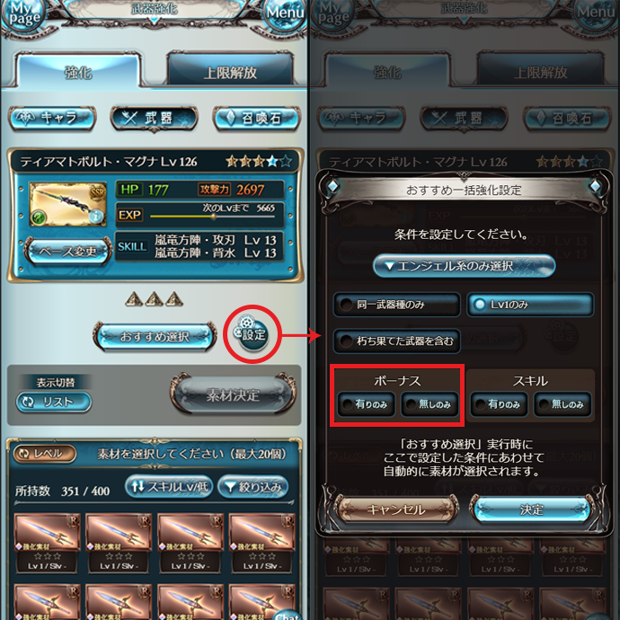 |
| July | -Added a favorite weapon/summon function. |
| August | -Added weapon/summon stash. -Support summons can now be set permanently. -Sending a backup request to everyone now includes crew members and friends. 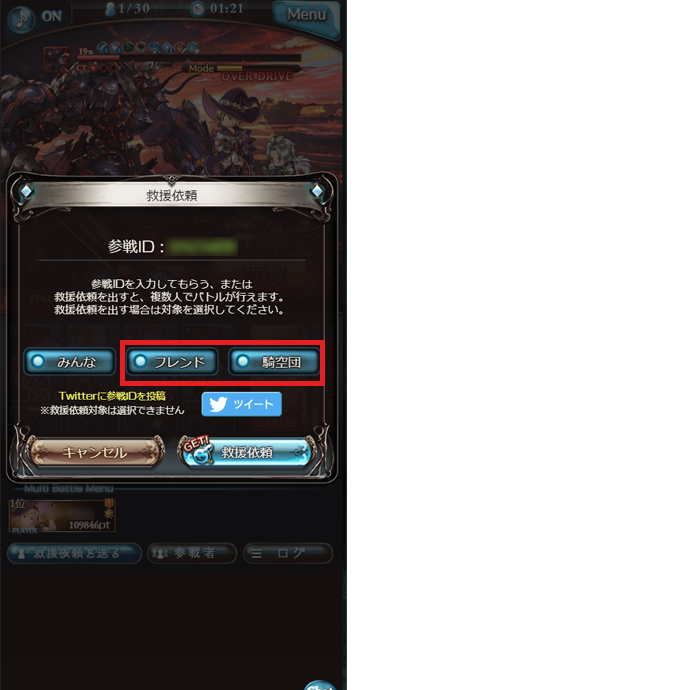 |
| October | -Charge bar values are now shown numerically. -Added a favorite quest function. |
| 2015 Updates | |
| February | -Added an Auto button to battles. -Recovery beyond max AP is now possible when using a full elixir or half elixir. |
| March | -Added former Extended Mastery Perks. |
| April | -Added reducing weapons/summons. |
| July | -Added former Extended Mastery Skills. |
| October | -Added prestige pendant/renown pendant feature.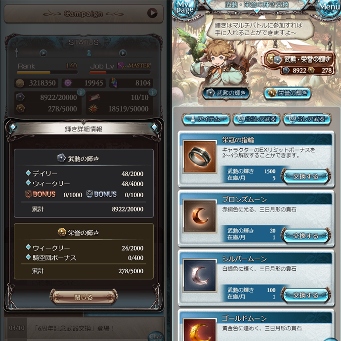 |
| November | -Added Twitter backup request function. -Added party settings. |
| 2016 Updates | |
| March | -Added an unload function to the Crate screen. -Added Trade Moons and Siero’s Special Pick ticket to the Shop. |
| September | -Added trial battles. -Added skill queue function.  |
| December | -Added Estimated DMG guide to the Party screen. |
| 2017 Updates | |
| March | -Extended Mastery Perks have been changed to Extended Mastery and added to characters other than just the main character. -The Journal has been updated and improved. |
| April | -Added raid battle room feature. -Added Auto function to raid battles. |
| June | -Added filters to supplies. |
| July | -Added side stories. -Added Repeating Quest settings. |
| August | -Began publication of This Is Granblue Fantasy comic for teaching newcomers about the game. |
| September | -Added a skip function to Premium 10-part draws. |
| October | -It is now possible to see at level 1 what weapons/characters/summons can be fully uncapped. -Subskills are now shown on the party selection screen before starting a quest. -When creating new slots in the Knickknack Shack to forge Revenant weapons, it is now possible to tap on each weapon and see what quests it can be obtained from. |
| November | -Started Arcarum: The World Beyond. |
| 2018 Updates | |
| January | -Doubled the number of parties able to be set. -The World screen now shows island names. -Added Reduce All function. |
| February | -Added Auto-Sell and Auto-Upgrade functions. -An illustration is now shown when sending a backup request. |
| March | -Revamped the Settings screen.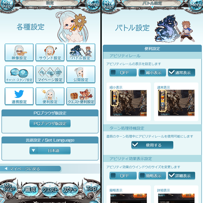 -Added Over Mastery bonuses and removed former Extended Mastery Perks. |
| April | -Added the ability to tap a treasure icon to view details. -Added a function to replay the same quest again. |
| May | -Added a function to filter the raid battle room list. -Added the ability to turn Auto mode on or off on the screen before starting a battle. -Added the fast expedition function to Arcarum: The World Beyond. |
| June | -Changed animations when upgrading characters/weapons/summons. |
| July | -Added the ability to exchange for required materials to uncap without changing screens. -Added the ability to display the amount of Shield HP remaining. -Added EXP reserve function. -Added the ability to view skill effects on the character details screen. |
| August | -Added Granblue FAQ! feature. |
| September | -Changed the way stories are displayed in the journal. |
| November | -Added the Cancel Attack button. -Revamped the Trophies screen. 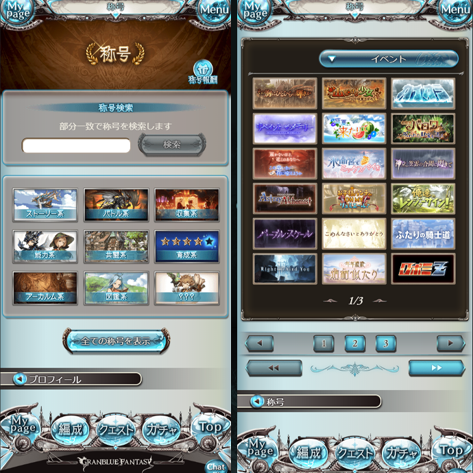 |
| 2019 Updates | |
| March | -Added the Evokers. -Added the ability to take on quests from treasure on the Uncap screen. -Revamped the Story Events top screen. |
| May | -Added job icons for players requesting backup and the number of players in battle to the raid batte screen. |
| June | -Revamped the Help page.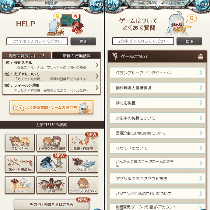 -Revamped trial battles. -Added the ability to view major item drops from displayed quests. -Added the Outfit Sets shop. |
| July | -Added the ability to earn treasure from a “How to Obtain” section in the item details popup. -Revamped the stash. |
| August | -Added the ability to uncap from the results screen when a character reaches max level. |
| September | -Added the ability to view the success rate of skill level upgrade when selecting materials to absorb. -Added an unload function for Rusted weapons. -Revamped the Class screen. -Revamped the Class Champion weapons’ page. |
| October | -Added Full Auto function. -Made adjustments to Home screen banners. -Added the ability to use recovery items by tapping on the AP and EP gauges on the Home screen. |
| November | -Added the Unequip All button on the details screen for an equipped weapon or summon. -Added functions to sort and filter specialty weapons for characters. -Revamped Sort settings. |
| December | -Added an icon for News on the Home screen. -Added the GBF Handbook. |
*All screenshots are accurate as of March 2020.
There are so many functions and features that everyone takes for granted now but were surprisingly not present in the game at launch.
The GBF development and administration team is committed to providing continual updates that make the game easier and more fun to play.