The Secrets of Content Design and What UI Designers Aim For: The UI Design That Forms the Foundation of the World of Granblue Fantasy (Part Two)
This March, the increasingly popular Granblue Fantasy celebrates its sixth anniversary. In Part 1, the UI (User Interface) team explained the everlasting essence of Granblue Fantasy, and the necessity to hold quality as a top priority.
Now in Part 2, we will talk to not only the same UI team about design outside of Granblue Fantasy, but also a UI designer of Granblue Fantasy Sky Compass (site available in Japanese only). Read to the end to see what these designers have to say about priorities in their work, and what skills and knowledge a good UI designer should have.
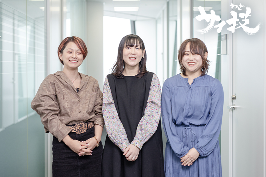
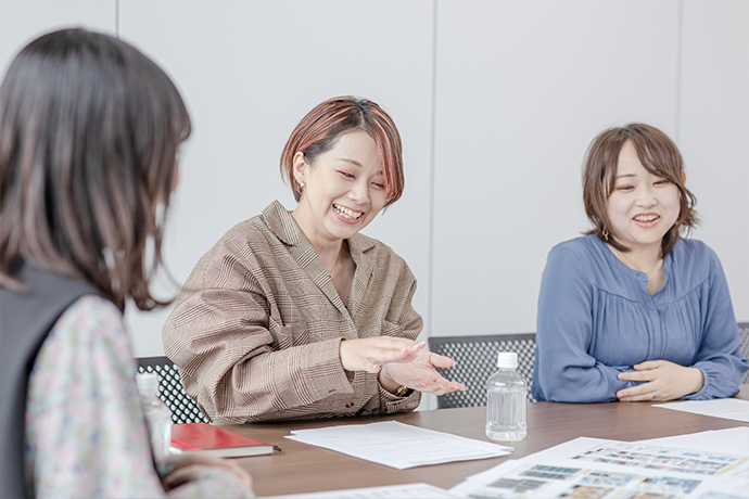
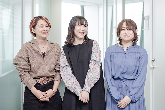
- UI Designer – Interaction Designer TeamNozomi

- Joined Cygames in 2015 after working as a designer for social games. After joining the GBF team and acting as UI team leader, Nozomi is now director of UI design while also working on UI production.
- UI Designer – Interaction Designer TeamSayaka

- Joined Cygames in 2015 after working as a 2D designer for social media services. She is currently involved in the development of GBF as a designer and is in charge of training for on-site team members.
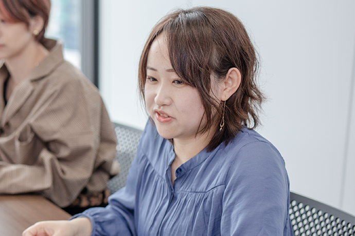
- UI Designer – Interaction Designer TeamRie

- Rie joined the company in 2018 after working in game illustration and UI design at another firm. After working as a UI designer for Granblue Fantasy, she is now in charge of UI design for Sky Compass.
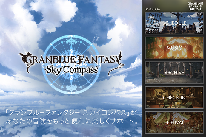
Sky Compass—Designed to Allow Players to Jump Right In.
It seems that the Granblue Fantasy UI team designs not just for the game, but also for a variety of tasks outside of it as well. Could you tell me more about what you do?
Sayaka: I’ve designed merchandise, CD sleeves, logos for events like Granblue Fantasy Fes, attraction signs, and even items used in the attractions themselves. I’m involved in a considerably broad field of work.
Nozomi: How much a UI designer works outside of a game depends on the company and the project, I think. But the Granblue Fantasy UI team has been in charge of quite a lot besides the game for a number of years now. In the Cygames office we also have a dedicated Design Production Team that handles all of the in-house titles, so work is divided according to each person’s own skillset in order to make the most of our work time.
Sayaka: The idea is that you’ll get the best outcome if you ask the design team since they know the most about Granblue Fantasy. So, after a few meetings, the UI team started getting assigned new tasks.
Is the thought process different when doing designs outside of the game compared to your UI work?
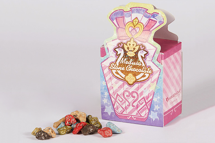
Sayaka: The basics are pretty much the same. What kind of world and characters should I bring to life, and who is the target audience? These issues have to be considered for both cases. To give you an example, when I designed Medusa’s Stone Chocolates, I used colors from Medusa’s character illustrations. Then I thought about how I could express her charm through the packaging. In the end, it turned out to be a cute, sparkly little package. (Laughs)
Rie: It was the same idea for Sky Compass. The UI was made in a simplistic square design with a distinctive Granblue Fantasy feel. Additionally, the app has a lot of features, so each of them had to be easy to use, as well as share the same vibe, just like Granblue Fantasy.
Very interesting. Speaking of Sky Compass, would you mind telling me a little more about it?
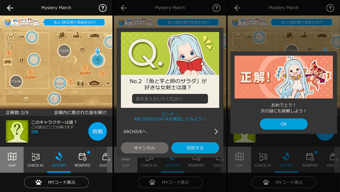
Rie: Sky Compass was released in March of 2017. The game consists of four major features. First, you can check what events are running inside and outside of the game through the Schedule. There’s also the Music and Archive features, where you can view character profiles and art, and listen to background music. The Check-In feature lets players receive special bonuses by taking pictures, and the Festival function keeps players informed on real-world events and festivals. Over the past three years, we’ve added more and more convenient features to the game. Every time something new is added, we take great care to make sure the design adheres to the standards set at the very beginning.
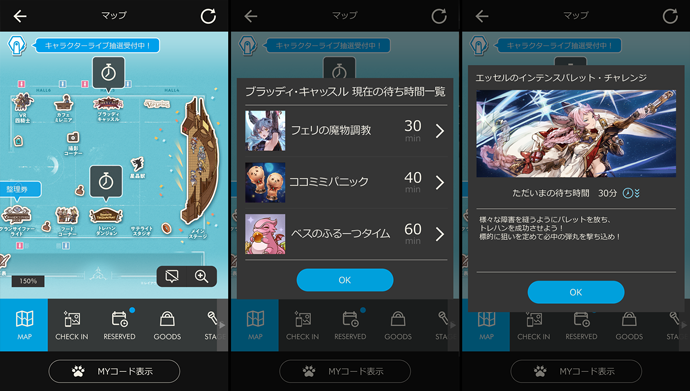
Rie: The Festival function was added to support Granblue Fantasy Fes 2018. It allowed players to see maps of the venue, wait times for attractions, and other things relevant to the event. The most important aspects of it were the ability to check wait times and stock availability at vendor stalls.
We updated the app up to the very last second. We wanted to make sure that players would feel they could enjoy Granblue Fantasy Fes even more with Sky Compass. I was really pleased to see people saying the app was easy to use at the venue, as well as on social media.
Sayaka: It was really great being able to see the wait times at attractions!
Rie: Since people could check the wait times, I think it made it easier for people to explore the event and made things smoother overall.
The Festival function is very convenient, isn’t it! Now, when you were designing the UI for Sky Compass, was there anything you were careful to keep in mind?
Rie: For the Festival function, I felt it was very important to include things related to the live event like the venue map function and digital merchandise tickets, while also making sure new users could easily navigate it. Some guests install the app for the first time right before attending, so I wanted to ensure that they could navigate the app easily even though they had never used it before that point. From a design perspective, we used the classic Granblue blue along with a black and gray theme to create a nice tranquil look.
What tactics did you use to make sure new users could pick up the app effortlessly?
Rie: For Granblue Fantasy Fes 2019, we implemented a lottery system for the live character show seats, but the process of applying for tickets ended up being a bit complicated. First, the event ticket was needed. Then you had to scan the ticket within the app to participate in the lottery. From the users’ perspective, it involved too many steps. On the invoice, the instructions were laid out in words only, so we added a graphical interface to allow users to understand the process much more quickly. We added an indicator that let users know what their next step would be, like those on online shopping sites, and how to complete the process.
I see. Those kinds of experiences could definitely garner new fans. As a UI designer, what kind of vision do you have for Sky Compass in the future?
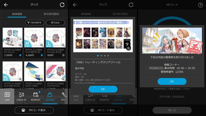
Rie: I think Sky Compass has a lot of potential to evolve, particularly in regards to the Festival function. I would really like to make it even more convenient for users. To give you an example, I would love to update the merchandise information page. Right now, you can register items you’d like to buy in your Favorites. However, when you go to buy those items, you need to list them up on a piece of paper and hand that to staff. For those orders, I would like to implement a bar code or in-app purchasing system. Details like that definitely have potential for streamlining.

“We want all of our skyfarers to have an amazing experience.” Proactive Suggestions from UI Designers.
Could you tell me about your favorite designs from outside of the game?
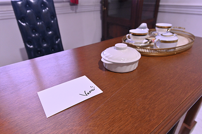
Sayaka: For me, it was the Letter from the Dragon Knights, which was made for the Dragon Knights VR attraction at Granblue Fantasy Fes.
In the middle of production, we talked about creating something physical to leave behind. We thought if we handed out letters from the Dragon Knights, people would get the feeling that the knights were really there.
So then I made a draft, designing the envelope and the letter. It included a message and signature from the character as well. It got a positive response, so eventually it was brought to fruition.
For the fans, that must have been quite a high note. Was the design of this letter also something that was dealt with very carefully?
Sayaka: Yes. I put a lot of attention into the texture and quality of the envelopes and letters, and I used signatures from a Valentine’s Day campaign as a basis for the writing. I was really glad to see how much the participants enjoyed those letters.
Initially the letters weren’t in the agenda for the attraction, but the event team was kind enough to adjust for them. Making the letters a reality and seeing everyone work together… That was a really great experience.
Having UI designers join in on the planning stage sounds really exciting. Are there any other instances of that happening?
Sayaka: Yes, it does happen from time to time. This is regarding internal game design, but when a project begins, we will have meetings to determine what the directors and planners want players to experience before we actually start designing anything. We then make suggestions and come up with our design plan based on what everyone thinks will make players happy.
The 6th Birthday Scratcher was one such crossover from UI design to planning. We had talked about wanting to do a special campaign for the sixth anniversary. We thought, “Why don’t we make a scratcher for Sierokarte to give as thanks to the captain?” After designing the scratcher and coming up with the process of giving them out, we suggested it to the planners. They agreed and the scratchers were brought to life. It always makes me feel so accomplished whenever I get to be a part of the planning process and help create these amazing things.
Speaking of the sixth anniversary, the Anniversary function was added to Sky Compass quite recently. What was the inspiration behind this addition?
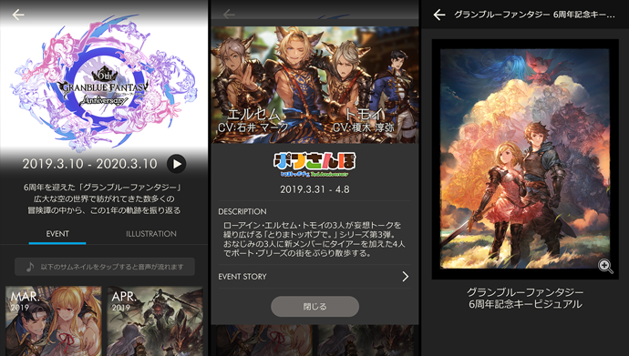
Rie: Up until last year we printed anniversary illustrations, but starting this anniversary we decided to add a showcase of the past year’s worth of Granblue Fantasy story events to Sky Compass. We took this opportunity as a team to discuss adding new elements now that we weren’t limited by the paper format. We also proposed to add in the Event History video, which is usually played before Granblue Fantasy Fes and special anniversary broadcasts, for a limited period.
With the Anniversary function, you can view the introductory videos for story events, as well as summaries and participating characters. The planners created the wireframe, and from there we went in from a design perspective to make sure the sixth anniversary logo stood out on the top, and that the events and thumbnails were pleasing to the eye.
Similarly, with the Gallery, you can see not only the anniversary countdown illustrations, but the anniversary key visual and logo as well. I really want everyone to see the effort the illustrators put into their work.
What’s Important to Granblue Fantasy UI Designers? Who Makes a Good UI Designer?
In your everyday work, what do you consider to be the most important thing to keep in mind?
Nozomi: As a supervisor of the Granblue Fantasy UI team, I think the most important thing is to maintain the worldview of Granblue Fantasy. In Part 1, I talked about being especially careful of color, and making sure not to create extreme differences in saturation and hue. Since Granblue Fantasy’s UI has several designers, maintaining consistency is paramount.
However, there can be some wiggle room depending on the nature of the content—comical or serious, we should match the mood. But even with that, it is important to keep the beauty of Granblue Fantasy in mind, and adjust anything that is too high-contrast or overtly colorful. It’s kind of a difficult thing to articulate, but I hope you get the picture.
Sayaka: The content of the game is always expanding and the design is always moving in new directions, but the basic color palette and core design is pretty consistent.
In regards to what is acceptable, you occasionally do tie-in events with an IP that has a vastly different look and color palette from Granblue Fantasy. Respecting that IP while also staying true to Granblue Fantasy must be challenging.
Sayaka: Nozomi touched on this in Part 1, but when we do a tie-in event, we will typically prioritize the style of our guest. However, there are no instances of the designs between us being completely opposite. Even when our styles are different, there is always some part that overlaps, such as colors and effects, and any common ground you can find, you can use.
I’ll also get high-quality illustrations from the illustration team, and from there I can draw upon their colors to create a cohesive design that matches both parties.
Going back a bit, what about you two? What do you consider to be the most important thing to keep in mind while you work?
Sayaka: I think we touched on this when we talked about the 6th Birthday Scratchers, but I think communicating with planners to find the best course of action would be what I consider most important. My reason for that is because planners put the most thought into how to make the game enjoyable for players. They’re always considering what the players feel and what impressions we should be leaving with them, especially during events or campaigns. What we aim for is always changing, so I make it a point to listen to their plans. After that, I think about how I can improve upon those plans from a design perspective and then propose those improvements.
Some may find that level of communication unnecessary, but I believe that it can produce a truly amazing piece of work. Other than that, I also value good relationships with people on the project! We meet up after work and on weekends to have dinner and kick back together.
Rie: I feel compelled to say something a bit different from the other two… (Laughs) To me, I think it’s important to communicate with the engineers as much as I can, and not just hand in a design and call it a day. Each department has its own viewpoints, and I think explaining and getting them to understand my thoughts is important.
In order to make life easier for both parties, we will sometimes look at the screen and brainstorm together. “Would implementing this be difficult?” “If need be, I can come up with an easier design.” I think this kind of communication is important.
It sounds like your job is similar to being a kind of interpreter, putting people’s ideas together and assembling a design from that.
Sayaka: We’re involved in a lot of different areas. We need to consider a lot of things, such as planning and implementation.
Rie: It’s almost like a kind of relay. I find it quite exciting. I enjoy when content continues to grow by adding designs to different structure specifications. I love working in the middle of that.
Nozomi: Earlier, Sayaka was saying that the UI is the point of contact between the players and the service. We design the very first thing a new player sees. If it isn’t good, they won’t stay and play. That is why I feel the urge to work so hard in that middle ground, helping to plan and implement ways to make players enjoy themselves. I believe it’s the same for new designs as well as current ones.
Would it make you happy to hear a player say something you designed is easy to use?
Nozomi: Absolutely. I sometimes see Tweets saying, “This is so simple and easy to use!” It’s really gratifying to read. I always take a screenshot when I see those. (Laughs)
Sayaka: I do that too. I save them and look at them when I’m feeling down. (Laughs)
When you were talking about design being a relay before, you mentioned that it required a lot of communication. Is there anything else you think is required for someone to be a good UI designer?
Nozomi: Simply put, someone who is open.
Sayaka: That might be something required for all members of society. (Laughs)
Nozomi: We give a lot of detailed feedback… Being able to accept that feedback, understand it, and adjust yourself to become better at your job is incredibly important. If you only correct what’s pointed out to you, you can’t grow.
Rie: Aside from that, being able to keep things organized is also important.
Sayaka: Yes! People who are good at organizing their notes could definitely make good designers. (Laughs)
Nozomi: UI designers have to plan and design, so being able to prioritize information is also a good skill to have.
Staying True While Pushing Boundaries: Continuing to Improve Granblue Fantasy.
As UI designers, what would you like to accomplish going forward?
Nozomi: I would like to increase the precision of the UI design team for Granblue Fantasy as a whole. I want members of the team to carry out whatever new ideas they have, as I supervise their work and help them improve their output. Overall, I want us to be true to the world of Granblue Fantasy while also being innovative, so I have to guide them while they do new things.
“Protect the essence of Granblue!” That sort of thing?
Nozomi: Yes, exactly. Though it’s a little embarrassing when you put it like that. (Laughs)
Sayaka: In that situation, I’m definitely the type to do as many new things as I want. (Laughs) I don’t want to be on the safe side just to get the supervisor’s approval. I’ve been here a long time, so I’m constantly looking for new directions to take. If I take things too far, Nozomi reels me in, so I just run until she stops me.
Rie: I’d like to try new things too. There are so many aspects to Granblue Fantasy, inside and outside the game. If we were to do something new at Granblue Fantasy Fes, for example, I would love to see something like AR added to Sky Compass. It doesn’t have to be something supplementary to Granblue Fantasy Fes, but more like something to make Sky Compass more exciting as a native app.
In this interview, we explored UI design from two angles. We hope this valuable insight will help you enjoy the game even more than before, and find the continual improvements in the game every time you play.
Now that we’ve celebrated our sixth anniversary, Granblue Fantasy will power up like never before to bring you even more fun in the future. We hope you continue to enjoy the game, and we look forward to a wonderful year with you!