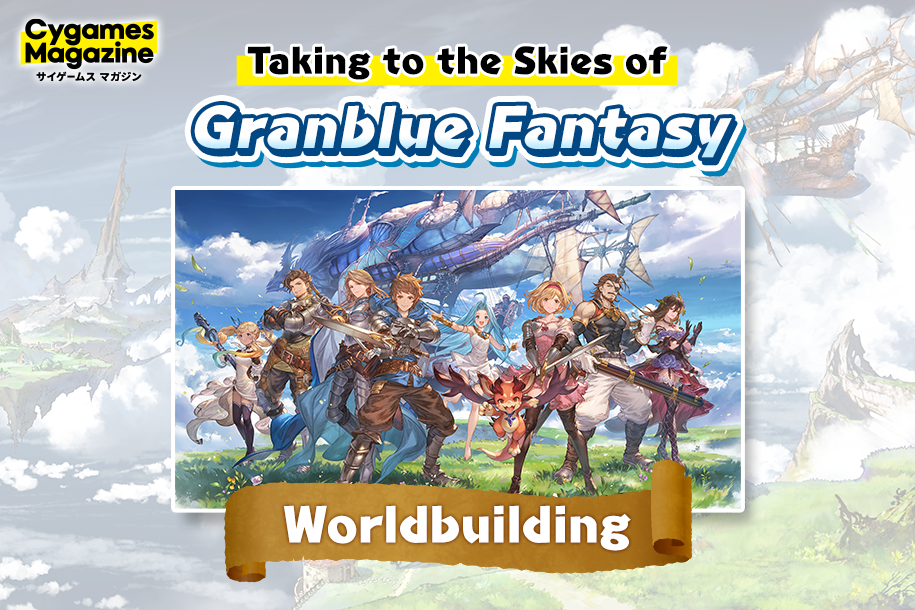
Behind Cygames’ Official Promo Art for 2026
Introducing the official promotional artwork celebrating Cygames and all its works for 2026! It will be featured in a variety of places and situations, including the official website, press releases, event backdrops, and more.
In this article, we’ll detail what went into the piece’s creation—from the illustrator’s original vision, to the process behind its production!
The Inspiration
It all began in 2024, while the company was participating in global events. At the time, with plans to exhibit in various countries and regions around the world, we realized we needed visuals that would instantly convey the essence of our games to potential overseas fans. And since the collage from Cygames Exhibition: Artworks (2023) was so well-received, we decided to create another visual in a similar style for future events.
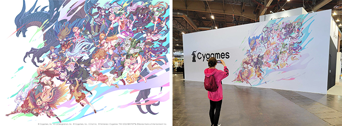
The 2025 official promo art was created specifically for global events, to be used as a booth backdrop or as art for promotional merchandise.
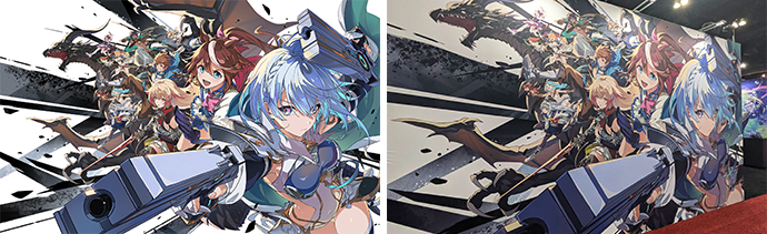
However, as our scope for 2026 expanded, we decided to create an official promo piece that could be used for both domestically and internationally. Going forward, it will serve as the face of Cygames across a variety of contexts, including advertisements, social media posts, booth backdrops, and press releases.
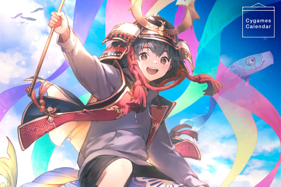
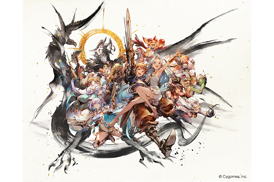
Harmony: A New Vision for the World in 2026
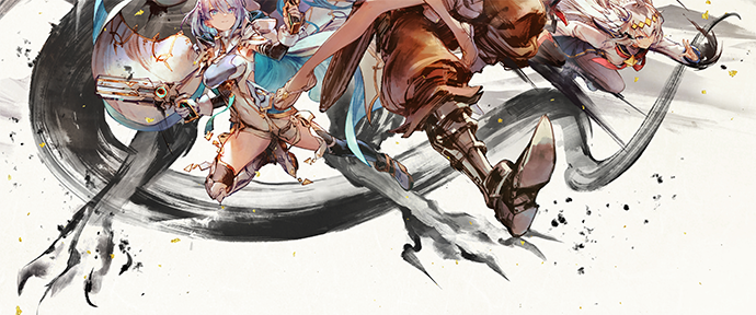
The 2026 illustration’s theme is based around “和/wa” (lit. “harmony,” but also refers to traditional Japanese style). Since the 2025 version had a trendy, dynamic vibe, we wanted to change things up and aim for something that conveys the joy and excitement of a Japanese festival. We also wanted to incorporate elements of Cygames’ commitment to stepping further into the global arena, so we settled on the concept of “leaping into the world as one.” That’s why you can see all of the characters moving forward, beyond the boundaries of their respective games. Finally, the single-stroke circle depicted behind Bahamut’s head, another common motif in Japanese art, emphasizes this sense of unity.
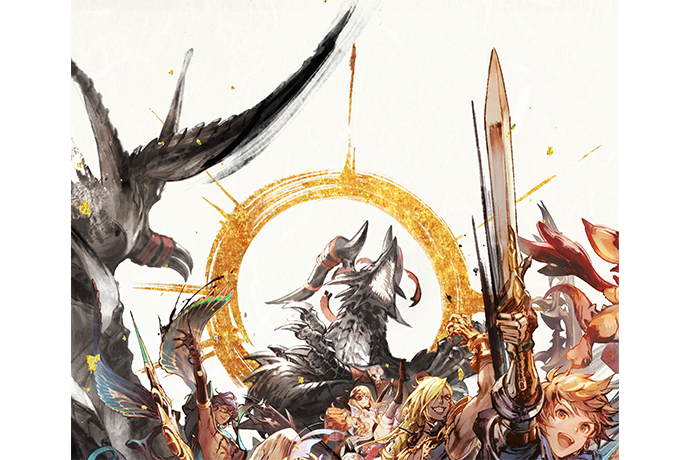
While working on the piece, the illustrators faced the challenge of balancing the visual interest of the brushstroke texture with the readability of the characters. Emphasizing the texture creates a dynamic energy, but if the strokes become too rough, the characters’ features and expressions become more difficult to identify. It was a struggle to find the balance between these two elements, but the team created custom brushes—finely tuning their coarseness, size, and line thickness—to help in this task. They also took a measured hand when it came to applying the ink painting-style: An overly rough approach would make the final piece feel dark and heavy.
Character Expressions
When considering how to depict the characters, the illustrators wanted to create a cohesive image while still adhering to the unique essence found in each game. Initially, they thought about giving each character a distinct expression, but to convey the joy and excitement associated with Japanese festivals, they decided to unify each character’s expression into a hopeful smile, creating a lively, uplifting mood.
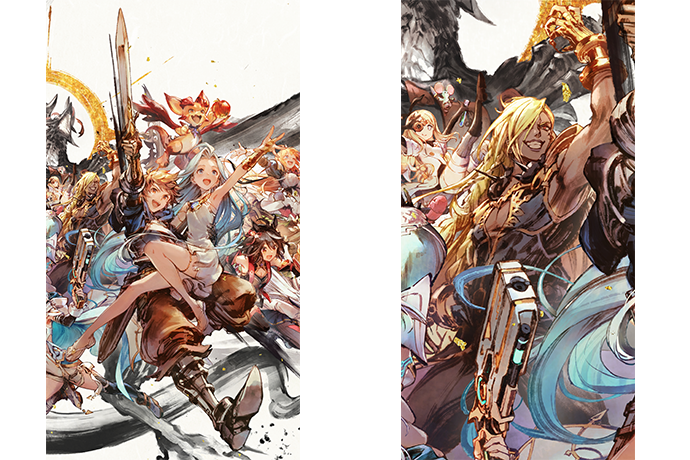
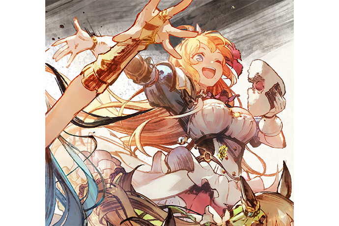
Careful attention was also paid to posing and composition to emphasize the unique charm of each character. And centered in the composition surrounded by characters from other Cygames titles are the protagonists from the Granblue Fantasy series—a nod toward Granblue Fantasy: Relink – Endless Ragnarok’s 2026 release date.
But every character has been illustrated to emphasize silhouettes that appear to be striding forward in active, full-body poses, ensuring that each stands out. Take Gran (Granblue Fantasy’s protagonist), Lyria, and Vyrn: they’re depicted as if they’re expressing their excitement for a new adventure by rallying the entire ensemble with a hearty “Onward!” Behind them, Beelzebub lifts a dominating hand to the skies, projecting his confidence to the world and adding a dramatic touch to the composition.
The cast of Shadowverse: Worlds Beyond were posed in accordance with their personalities—active, elegant, and buoyant poses all make their appearance here. Dreizehn, specifically, was illustrated with a gentle expression in order to maintain consistency with the rest of the cast.
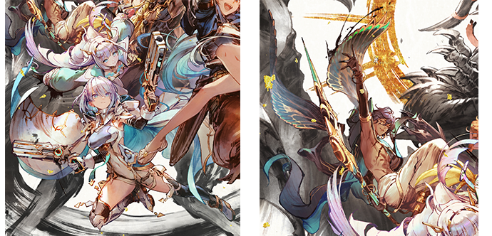
Meanwhile, characters from Umamusume: Pretty Derby were depicted with a sense of velocity, reflecting their competitive and inspiring relationships.
The single brush stroke around Bahamut’s head mimics a roar and serves as an eye-catching visual accent. Originally, Bahamut was meant to be clearly depicted from horn-to-tail, but the illustrators deliberately depicted his lower half in a rougher style to prioritize the brushwork, greatly enhancing the overall cohesion and visual impact of the image.
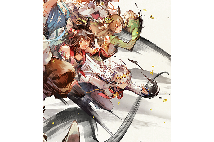
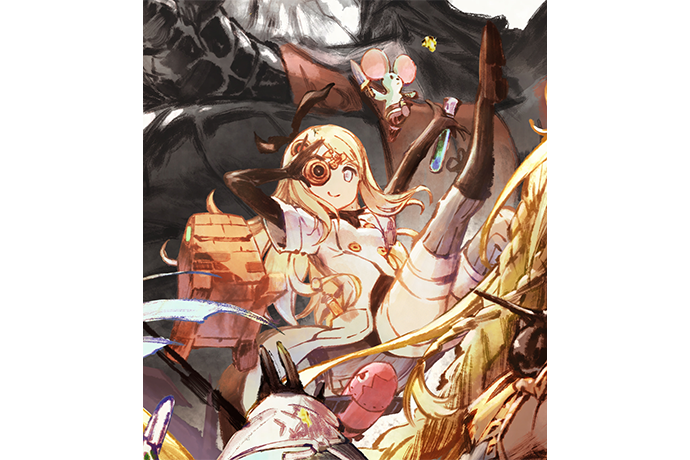
As for characters from other games, there are tons of details hiding in this image. See how many you can spot!
Every Stroke a Team Effort
To fulfill the concept of this year’s promo art, it was necessary to incorporate characters from multiple games, while weaving them together with the visual language of traditional Japanese elements. To accomplish this, we enlisted staff with expertise in various fields, including composition, linework, and coloring.
This was a big challenge for the company, as it’s rare to task illustrators with creating official corporate art centered around traditional Japanese aesthetics. Although it’s a single illustration, the brushwork texture took meticulous testing—especially for the characters positioned in the foreground—while additional design considerations were given to layer organization, custom brush options, and standardizing line thickness.
Altogether, this piece was completed thanks to the united efforts of our talented illustrators. This work would not have been possible without each of their unique strengths, and for that we think it exemplifies the “Team Cygames” ethos. We hope you’ll take some time to appreciate their hard work!
Related Article